To conclude this journey, this is our final product, which months of research & planning has been building up to.
Sunday 13 April 2014
Saturday 12 April 2014
Evaluation 4) How did you use new media technologies in the construction and research, planning and evaluation stages?
Throughout our A2 course, we've used a range of technologies in order to help us with the various stages. Some technologies we hadn't used before, but some we already had experience with. I will now introduce everything that we have used and evaluate their usefulness.
Research and planning stage
Hosting sites like Youtube were used often in our research and planning stage, to both present our work and look at existing works for inspiration (for example, we could search for short films to watch to help us with creating ours). Youtube was useful to use as it has a very simple layout and an easy process for uploading so it made uploading videos quick and easy. We used it to upload various videos like our rough cut, animatic and final cut, and of course it helped us in the research stage when we were looking into various short films for inspiration. It also came in useful in the final stage of evaluation, when we uploaded the Director's Commentaries. We also used another hosting site called Vimeo to upload the video we made for the Production Progress Review. This again was simple to use, however we only used it once as Youtube felt more comfortable to use. To upload text documents we used Scribd, which came in useful for works like the script, props list, and storyboard. It helped to make our blog posts look a bit neater aswell, and also kept the documents organised. We also used Blogger to present all of our work.
Construction & Feedback
Some of the recording devices we used was to create a film included HD cameras, recording kits, Soundtrack Pro and audio recording kits. Compared to old media technologies, using digital cameras and kits are much easier, as they can be uploaded through the use of a USB and separate takes appear as separate files, so editing is an easy process. We also used various ways to collect our feedback, sometimes we recorded it with an HD camera, and in other cases we just recorded the audio with a recording kit. We then uploaded the recorded feedback on Youtube and Soundcloud (a music hosting site). Recording the feedback in such a way - as oppose to writing it down - is brilliantly effective, as it means we can easily access the feedback if we want to in the future by either watching it on Youtube or listening to it on Soundcloud, thus saving us time when we wish to make improvements
Soundtrack Pro is software which allows us to edit audio and overlay it on to our film (it also allows you to use it's own foley sound, means we don't have to record every sound ourselves). Again, this is another device which made our construction phase a simpler process, as its a very easy software to use.
Editing software
The main source for editing our film is through Final Cut Express. We've had lots of experience using it from our preliminary task last year and and our 2 minute film opening that we also did the previous year. It's a video editing software that is simple to use, as we just upload our shots, and then edit them into the film we want. In editing terms we've only really ever used Final Cut so we can't necessarily compare it to anything else, but it definitely feels simple to use, and cut a lot of time out of what is quite a long winded process. We also used Soundtrack Pro to add sound over the top.
Ancillary product software
To produce our ancillary products (magazine review and poster) we used Quark Xpress and Photoshop. It was my first year of using both software, and I had practise at the start of the year with Quark when we did our draft magazine review and mock magazine cover. Quark Xpress is easy to use, however Photoshop is a lot more complicated to use than Quark, so Connor (who has lots of experience with it) had to help us with it.
Research and planning stage
Hosting sites like Youtube were used often in our research and planning stage, to both present our work and look at existing works for inspiration (for example, we could search for short films to watch to help us with creating ours). Youtube was useful to use as it has a very simple layout and an easy process for uploading so it made uploading videos quick and easy. We used it to upload various videos like our rough cut, animatic and final cut, and of course it helped us in the research stage when we were looking into various short films for inspiration. It also came in useful in the final stage of evaluation, when we uploaded the Director's Commentaries. We also used another hosting site called Vimeo to upload the video we made for the Production Progress Review. This again was simple to use, however we only used it once as Youtube felt more comfortable to use. To upload text documents we used Scribd, which came in useful for works like the script, props list, and storyboard. It helped to make our blog posts look a bit neater aswell, and also kept the documents organised. We also used Blogger to present all of our work.
Our animatic on Youtube
Construction & Feedback
Some of the recording devices we used was to create a film included HD cameras, recording kits, Soundtrack Pro and audio recording kits. Compared to old media technologies, using digital cameras and kits are much easier, as they can be uploaded through the use of a USB and separate takes appear as separate files, so editing is an easy process. We also used various ways to collect our feedback, sometimes we recorded it with an HD camera, and in other cases we just recorded the audio with a recording kit. We then uploaded the recorded feedback on Youtube and Soundcloud (a music hosting site). Recording the feedback in such a way - as oppose to writing it down - is brilliantly effective, as it means we can easily access the feedback if we want to in the future by either watching it on Youtube or listening to it on Soundcloud, thus saving us time when we wish to make improvements
Soundtrack Pro is software which allows us to edit audio and overlay it on to our film (it also allows you to use it's own foley sound, means we don't have to record every sound ourselves). Again, this is another device which made our construction phase a simpler process, as its a very easy software to use.
 |
| Our audio being edited on Soundtrack Pro |
Our rough cut feedback on Soundcloud
Editing software
The main source for editing our film is through Final Cut Express. We've had lots of experience using it from our preliminary task last year and and our 2 minute film opening that we also did the previous year. It's a video editing software that is simple to use, as we just upload our shots, and then edit them into the film we want. In editing terms we've only really ever used Final Cut so we can't necessarily compare it to anything else, but it definitely feels simple to use, and cut a lot of time out of what is quite a long winded process. We also used Soundtrack Pro to add sound over the top.
 |
| Us using Final Cut Express to edit our short film |
Ancillary product software
To produce our ancillary products (magazine review and poster) we used Quark Xpress and Photoshop. It was my first year of using both software, and I had practise at the start of the year with Quark when we did our draft magazine review and mock magazine cover. Quark Xpress is easy to use, however Photoshop is a lot more complicated to use than Quark, so Connor (who has lots of experience with it) had to help us with it.
 |
| Quark Xpress was used to create this magazine review |
 |
| Photoshop was used to create this poster |
In order to organise ourselves properly we used the social network site Facebook in order to communicate with actors and people in our crew. This was invaluable, as Facebook chat allows you to see when someone has read a conversation, and the group chat feature means that you can have a conversation with multiple people. This is far more advanced than texting or calling each person individually, and it helped us to organise when we were going to be filming next.
Another thing to help us with organisation was the school's booking system, which allowed us to book our equipment, and also see when everyone else has booked theirs so that we didn't clash. This was invaluable, and without it I can imagine the process of booking equipment would have been quite chaotic: this made it foolproof.
Another thing to help us with organisation was the school's booking system, which allowed us to book our equipment, and also see when everyone else has booked theirs so that we didn't clash. This was invaluable, and without it I can imagine the process of booking equipment would have been quite chaotic: this made it foolproof.
 |
| School Booking System |
 |
| Screenshot of a conversation on Facebook
Overall, these new media technologies have helped us to complete our various products to a high standard, and made each process of our course much easier. They have enabled me to produce work, edit and construct, record and evaluate, and display work in an effective and creative manner.
|
Thursday 10 April 2014
Evaluation 3) What have you learned from audience feedback?
Audience feedback has been crucial in helping us to continually improve the standard of our work. Asking our target audience for their opinion means that what we produce will be fitting for who we're aiming it to be for, and also helps us to realise any improvements we need to make that we may not have noticed.
Below is a few examples of feedback that we collected during our creative process:
Research & Planning Phase
The first audience feedback we had was from the pitches of our short film ideas. The whole class, including Mr Hood, gathered to discuss things like practicality, whether it included typical conventions of a small film, and whether the idea could fit in to a 5 minute long film. Every person's feedback was different as we all had different ideas. It was only until we were assigned in to our production teams that we went over the feedback, and then from that we decided upon which short film idea would be best to follow.
The next feedback we received was from our Production Progress Review. This was when we told the class what tasks we had completed so far, what was left to do and how we were going to delegate them. Below is the Vimeo of that review:
Feedback included ideas on how we should maintain quality assurance, and how Ryan should match his treatment up to Connor's vision. This helped us to organise ourselves a bit more, which we needed to do at that point.
A few weeks later we decided upon a target audience, which primarily included men aged from 25-45. This meant that we could have feedback from the exact people who we want to watch our film, which is useful as their opinions matter the most. Ryan made a draft of the film treatment, and showed it to various members of our target audience. Some feedback included that the 'happy scene' needed to be longer, and that there needed to be more insight in to Dave's character. Below is our draft treatment, and then our final treatment with amendments made.
REC Treatment Updated
Construction stage
Probably the most important feedback we had was the feedback for the rough cut of our film. Our film had to be fit for our target audience and also had to be a good short film that could please an audience.
Below is our recorded feedback which we uploaded on to Soundcloud:
We received a lot of feedback - all of it useful - which included things such as "we need to add credits", "train shots are too long and could be cut down to save time" and "the ending was too abrupt". The feedback helped us to realise some things that we didn't notice, and gave us a clear insight in to what our target audience thought of our film. We made a lot of adjustments to our film thanks to the feedback, and this below is the finished product:
Ancillary Stage

Above is the draft of our magazine review that we created on Quark Xpress, before any feedback. Feedback included things like there is too little space around the runaround, the framing of the photo isn't quite right, and there is too much space between the title and the rest of the text. With this feedback in mind I was able to improve the magazine review by quite a considerable amount, and below is the finished result:

As you can see this final version is more visually appealing, and audience feedback helped us to create something a lot more professional looking than the initial version.
The same applies to the film poster we created. We created a draft version, and after collecting considerable feedback (such as we should include text to say something like 'coming soon' to spark intrigue, and to make the logos at the bottom smaller as they are too distracting) we were able to improve and create a more appealing film poster to promote our film. Below is the draft of our film, and then the final version with amendments made:
 |
| Rough version |
 |
| Final version |
Wednesday 9 April 2014
Evaluation 2: How effective is the combination of your main product and ancillary tasks?
Director's Commentary
Analysis Of Film
Analysis Of Ancillary Product 1: Movie Poster
Analysis Of Ancillary Product 2: Magazine Review
Tuesday 8 April 2014
Evaluation 1) In what ways does your media product use, develop or challenge forms and conventions of real media products?
Keyframes
I have selected several frames from our own short film and other original films in order to compare them and the conventions they share or challenge.

Frame 1: Camera Shots/ Angles


My first comparison is the shot of Dave waking up in "Dave" and of the main protagonist waking up in "Groundhog Day", as an original influence for our short Groundhog Day shares many similarities with our film in that it features the same repetitive day occurring over and over again. This shot of Phil Connors (Groundhog Day) waking up and turning his alarm off is straight on shot, we decided to go against this and go for a birds eye view of the shot as we wanted the audience to realise how early Dave was getting up, as is similar for Groundhog Day where their intention is to show the time he gets up also. As in both films this scene reoccurs several times to portray to the audience that the main character is going through a life that demands change, in accordance to Todorov's narrative theory of equilibrium it creates tension through the first phase of the film that is the equilibrium and therefore signals to the audience that something needs to change, which is the queue for the 2nd phase that is a disruption to the equilibrium, in both our film and Groundhog Day there is then a disruption to the equilibrium and so the narrative is interesting for the audience.
Frame 2: Colour


Something we intended from the beginning of our piece was the 'filter' we would be applying in post-production, the purple-blue hue of our filter is symbolic code for dullness, the film Groundhog Day has several scenes (particularly the morning scenes) where we can see these colours in the frame, they imply the repetitive and dull lifestyle that our film also implies. The reason we have used purple also is subtle foreshadowing towards the plot-line, the colour purple is traditionally known to represent royalty, and as Dave comes into money (in his dream) the colour hints to the plot of the film, but as Dave wakes up and realises he is still at the same dead-end job, we realise the chance of wealth is unlikely, and the audience comes to term with the fact that Dave will be stuck there forever.
Frame 3: Composition:

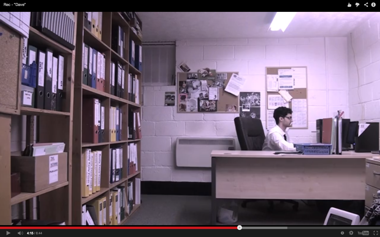
We chose this shot because we wanted Dave to appear small, in this frame Dave is not centred and he is far from the camera, this portrays to the audience that Dave is insignificant and is not an important person, also in this frame are the masses of folders along the left wall, we showed this because we want the audience to understand how much work Dave has to do, and how lonely he is in the office. This encourages an emotional response from the audience because they would feel sympathetic towards him for being so alone and having so much work to do, it is blatant to the audience that he has no friends and therefore no social life, this could also evoke an empathetic response from members of the audience who feel the same way. Similar to this shot is the deleted scene from "Fight Club", in this shot the camera tracks around a large glass window with black panes that distort the image of the man sitting at the desk, the framing here makes him look small and bored, though still keeping the attention on him, we decided not to have a tracking shot as we wanted to exemplify Dave's stationary career.
Frame 4: Costume:


A significant effort was put into making our costume represent our character very well, as is visible we we were inspired by Shaun of the Dead's main protagonist, who suffers the same dead-end career path. We chose to use a black tie to follow our monochrome pallet that is evident throughout our film and ancillary tasks, on each of the consecutive days Dave goes through, his tie gets progressively looser, we do this to show Dave's growing lack of interest and raise tension for the audience. We also chose to use a long-sleeve shirt as it felt more professional for an accountant, as oppose to Shaun who sells kitchen equipment which is more casual.
Frame 5: Editing:


In the post-production stage we sequenced the 3 shots of work piling up and cross-dissolved the shots to show passage of time, the scene from the film "Birds" uses this dissolve also to show passage of time as it is a slow transition and works well. It works well in our film because it's a slow transition and we use a fairly slow paced editing to reiterate the slowness of Dave's life by making everything drag on. This montage of shots concisely defines Dave's work ethic, and how the work is piling up because he does nothing about it.
The way in which we montage three shots of the same angle together is a challenged conventions for films, usually films use dissolve transitions to show a passage of time and change of location, like in "Birds" by Alfred Hitchcock, "Citizen Kane" and "a place in the sun" by George Stevens, however we decided to not change the location or angle to portray to the audience the lack of movement in Dave's life, and that he is getting nowhere.
Frame 6: Facial Expressions


An important aspect to consider when portraying a particularly "upset" character is the use of facial expressions. We instructed our actor Nazario Jackson to apply expressions such as:
- Half-closed eyes: These show tiredness, an imperative attribute of our character to reinforce his dissatisfaction with his life choices.
- Closed, emotionless mouth: A closed mouth suggests he has nothing to say and no one to talk to, hence why we chose this, it makes Dave appear lonely and uninteresting. Situations such as yawning are the only opportunity for him to open his mouth, apart from the dream scene in which Dave shows his teeth whilst smiling, showing a contrast from his conscious self.
- Relaxed cheek bones/eyebrows: To raise your eyebrows or tense cheekbones are associated with actions such as smiling, or surprise, which may indicate energy and interest from Dave, which is exactly the opposite of what we want to convey, so therefore we asked Nazario to not put any effort into his eyebrows or cheekbones and keep them relaxed.
We took the inspiration of these characterisation techniques from "Shaun of The Dead", in which Shaun applies these characteristics when we are being shown his side of life associated with his career. We believe this would show to the audience how Dave feels about his life without the need for words.
Frame 7: Location:


The location is an important consideration when exposing your character. For example these 2 keyframes show similar office layouts, in our film we have a desk that is much bigger than a standard desk, thus showing that there would be a lot of work and clutter on the desks which implies disorganisation and a a lack of interest towards the career. Another similarity is the computer, in the Fight Club frame the computer is old-fashioned, and in ours the computer is small, showing that perhaps the characters are not important in their job, and are probably at the bottom of the pile in which they cannot progress through their job (or they can, and due to their disinterest that choose not to) . In both shots the main character is on their own, they have no communications and the lighting in the room is dull, in Fight Club the blinds are shut, showing him not accepting life or the outside world, in our short film, Dave is subject to artificial lighting and works underground, this is symbolic for loneliness and deprivation of life, hence depression.
Frame 8: Sound:
This is an original short titled "Dead End Job", and in the opening 2 seconds one of the main protagonist sighs, we have done something similar to this with our short film.
The sigh in both films represents a hatred towards the monotony and repetition of life and doing things we just don't want to do, it also represents the disappointment in themselves for being where they are. The original short film "Dead End Job" uses the sigh naturally in conversation, however in our short film we use the sigh 3 times to signify the end of the day, at the final exhalation the credits come up for Dave and it is the end of the film showing nothing has changed. By placing it over a black slug we intended for 2 effects upon the audience, firstly having no image allows the audience to have total concentration on the sound so they can recognise that Dave is fed up, and secondly it can resemble either Dave closing his eyes or night-time, either way suggesting it is the end of the day. It is then succeeded by the following day.


Frame 9: Title:


After researching into what font makes a boring font, we came to the conclusion that "Courier" font was a very plain and uninteresting font, it has similarities to Groundhog Day in that it holds itself together very formally and doesn't break any boundaries, however our font is not all in capitals and we have used a full stop. We wanted this full stop to signify a dead end, as in Dave's dead end career. It also suggests that there is nothing after it, it is the end of the sentence and that there is nothing more to him, he is very plain. We chose to have white text because it is the most empty colour and is also very visible on a black background.
Monday 7 April 2014
Re-editing Footage
We made several changes in our final editing stage.
Shots we deleted/trimmed.
We deleted a few shots from the morning that are repeats (especially if they are of the same framing). And also deleted the Dave wipe; the photocopier screen shot, the close-up at the train station, and trimmed the ends of some office shots and train shots. We L-cut the sound of Dave's head hitting the table into the black slug of the next day as well as we felt this was an interesting use of sound and shot duration. We also trimmed the morning shot of the steam hitting the camera as it didn't suit the context.
Shots we changed.
We fixed the filter of one of the shots, as there were accidentally 2 filters on there. We added music over the whole dream sequence to add flavour to it, showing his life gaining emotion, however the music cuts as soon as he wakes up.
Shots we added.
We filmed 3 shots for the dream, an establishment shot for the bank, and 2 of him going to it. We decided on our favourite one and sequenced it into the film. We also re-recorded the alarm shots with no camera wobble and using the right date, they were significantly better than the original ones.
At the start of the film we included a simple title of "Dave" at the start, after researching fonts we found 'Courier' to be a very bland and dull font, yet still professional, aptly summing up Dave's life.
At the end we added credits for the actor and crew, we timed it so that as Rio releases his big sigh as his name comes up.
Re-shoot Evaluation
Everybody attended the re-shoot and everything was filmed, we are happy with our new shots and have sequenced them into the film. We will add this into the dream scene.
Things we had to consider:
Things we had to consider:
- It was important to film at the right time of day as Dave would have been at work for hours already so we had to film around 12/1pm.
- Reflections in the window of the bank, we avoided this by the angle of which we filmed.
- Members of the public, problems here could be them looking into the camera as this doesn't look professional, also them tripping over our equipment or getting in the way of Rio, we were aware of all problems and stayed observant to avoid them.
- Any continuity errors or bad frames. There won't be any chances to re-shoot again so we watched the footage back straight after we filmed it to make sure it was good.

Feedback, Analysis and Re-shoot Schedule
Rough Cut Feedback and Analysis
To compartmentalised each separate point into a list that we could go through one by one, the first list is what we need to change that has been addressed, the second list is things that were said but we decided against doing.
- Lauren felt the fogging up of the camera looked like a mistake.
- They agreed the ending was too abrupt, they felt they wanted to see him do more with the money like go to the bank or go to a car shop.
- There were a few moments that appeared to blur, we reckon this is to do with the conversion type we used, and we will use something different for the final film.
- Cut the train shots down as they are too long, we get the meaning!
- The waking up shots of Rio's arm turning the alarm off need to be re-recorded, the angle of Rio's hand going in makes it not appear 1st person, and the camera wobble is very distracting, also the date on the phone is wrong.
- A few office shots are too long. For the example the shot of his head on the table is way too long, could cut it down to be so it cuts to a black slug as soon as his head hits the table.
- Add some music somewhere, at least when he is in his dream! Shows emotion and colour for him.
- Get rid of repeat shots in the mornings or make them as short as possible, the mornings needs to get exponentially snappier like in Groundhog Day, needs to keep the attention of the audience.
- The filter of one of the shots is much different than the others, needs to be adjusted.
- Credits need to be added.
- Delete the shot of Rio close-up at the train station, goes out of frame too much.
- Delete the Dave wipe, and replace it with a black slug with "Dave" at the start.
- Delete the photocopier screen shot, too bright.
We will be re-recording the alarm shots as we agree that it could cost us marks, we also film Rio going to HSBC with the money to expand on the ending and add music to increase the 'happiness' of the dream. The small cuts, shortening of clips, and small problems such as an incorrect filter, adding a filter and title of "Dave" will also be done.
- Should the blue REC button be red?
- Rio needs a coat, re-record.
A high amount of this feedback we agreed with and prepared to make adjustments with. However "re-recording the train shots of Rio with no coat" we disagreed with as we want the audience to sympathise with him, he is quite a depressing person and so he cares as to whether he hurts himself. Also the REC button being blue is a creative choice.
Conclusively, we were given a band 2/3 mark for our piece, and set ourselves the target of getting it to a high band 3.
We scheduled our re-shoot.

Conclusively, we were given a band 2/3 mark for our piece, and set ourselves the target of getting it to a high band 3.
We scheduled our re-shoot.
We need to make sure everything is shot well with good framing as there won't be an opportunity to redo them.
Subscribe to:
Posts (Atom)