Keyframes
I have selected several frames from our own short film and other original films in order to compare them and the conventions they share or challenge.

Frame 1: Camera Shots/ Angles


My first comparison is the shot of Dave waking up in "Dave" and of the main protagonist waking up in "Groundhog Day", as an original influence for our short Groundhog Day shares many similarities with our film in that it features the same repetitive day occurring over and over again. This shot of Phil Connors (Groundhog Day) waking up and turning his alarm off is straight on shot, we decided to go against this and go for a birds eye view of the shot as we wanted the audience to realise how early Dave was getting up, as is similar for Groundhog Day where their intention is to show the time he gets up also. As in both films this scene reoccurs several times to portray to the audience that the main character is going through a life that demands change, in accordance to Todorov's narrative theory of equilibrium it creates tension through the first phase of the film that is the equilibrium and therefore signals to the audience that something needs to change, which is the queue for the 2nd phase that is a disruption to the equilibrium, in both our film and Groundhog Day there is then a disruption to the equilibrium and so the narrative is interesting for the audience.
Frame 2: Colour


Something we intended from the beginning of our piece was the 'filter' we would be applying in post-production, the purple-blue hue of our filter is symbolic code for dullness, the film Groundhog Day has several scenes (particularly the morning scenes) where we can see these colours in the frame, they imply the repetitive and dull lifestyle that our film also implies. The reason we have used purple also is subtle foreshadowing towards the plot-line, the colour purple is traditionally known to represent royalty, and as Dave comes into money (in his dream) the colour hints to the plot of the film, but as Dave wakes up and realises he is still at the same dead-end job, we realise the chance of wealth is unlikely, and the audience comes to term with the fact that Dave will be stuck there forever.
Frame 3: Composition:

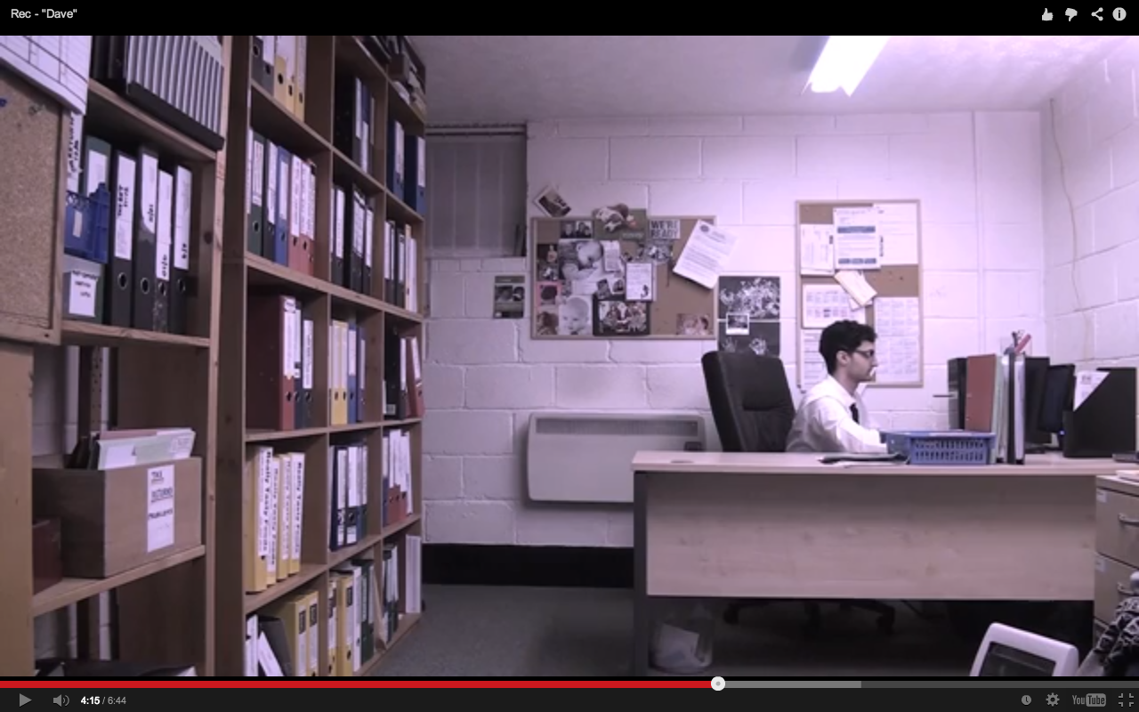
We chose this shot because we wanted Dave to appear small, in this frame Dave is not centred and he is far from the camera, this portrays to the audience that Dave is insignificant and is not an important person, also in this frame are the masses of folders along the left wall, we showed this because we want the audience to understand how much work Dave has to do, and how lonely he is in the office. This encourages an emotional response from the audience because they would feel sympathetic towards him for being so alone and having so much work to do, it is blatant to the audience that he has no friends and therefore no social life, this could also evoke an empathetic response from members of the audience who feel the same way. Similar to this shot is the deleted scene from "Fight Club", in this shot the camera tracks around a large glass window with black panes that distort the image of the man sitting at the desk, the framing here makes him look small and bored, though still keeping the attention on him, we decided not to have a tracking shot as we wanted to exemplify Dave's stationary career.
Frame 4: Costume:


A significant effort was put into making our costume represent our character very well, as is visible we we were inspired by Shaun of the Dead's main protagonist, who suffers the same dead-end career path. We chose to use a black tie to follow our monochrome pallet that is evident throughout our film and ancillary tasks, on each of the consecutive days Dave goes through, his tie gets progressively looser, we do this to show Dave's growing lack of interest and raise tension for the audience. We also chose to use a long-sleeve shirt as it felt more professional for an accountant, as oppose to Shaun who sells kitchen equipment which is more casual.
Frame 5: Editing:


In the post-production stage we sequenced the 3 shots of work piling up and cross-dissolved the shots to show passage of time, the scene from the film "Birds" uses this dissolve also to show passage of time as it is a slow transition and works well. It works well in our film because it's a slow transition and we use a fairly slow paced editing to reiterate the slowness of Dave's life by making everything drag on. This montage of shots concisely defines Dave's work ethic, and how the work is piling up because he does nothing about it.
The way in which we montage three shots of the same angle together is a challenged conventions for films, usually films use dissolve transitions to show a passage of time and change of location, like in "Birds" by Alfred Hitchcock, "Citizen Kane" and "a place in the sun" by George Stevens, however we decided to not change the location or angle to portray to the audience the lack of movement in Dave's life, and that he is getting nowhere.
Frame 6: Facial Expressions


An important aspect to consider when portraying a particularly "upset" character is the use of facial expressions. We instructed our actor Nazario Jackson to apply expressions such as:
- Half-closed eyes: These show tiredness, an imperative attribute of our character to reinforce his dissatisfaction with his life choices.
- Closed, emotionless mouth: A closed mouth suggests he has nothing to say and no one to talk to, hence why we chose this, it makes Dave appear lonely and uninteresting. Situations such as yawning are the only opportunity for him to open his mouth, apart from the dream scene in which Dave shows his teeth whilst smiling, showing a contrast from his conscious self.
- Relaxed cheek bones/eyebrows: To raise your eyebrows or tense cheekbones are associated with actions such as smiling, or surprise, which may indicate energy and interest from Dave, which is exactly the opposite of what we want to convey, so therefore we asked Nazario to not put any effort into his eyebrows or cheekbones and keep them relaxed.
We took the inspiration of these characterisation techniques from "Shaun of The Dead", in which Shaun applies these characteristics when we are being shown his side of life associated with his career. We believe this would show to the audience how Dave feels about his life without the need for words.
Frame 7: Location:


The location is an important consideration when exposing your character. For example these 2 keyframes show similar office layouts, in our film we have a desk that is much bigger than a standard desk, thus showing that there would be a lot of work and clutter on the desks which implies disorganisation and a a lack of interest towards the career. Another similarity is the computer, in the Fight Club frame the computer is old-fashioned, and in ours the computer is small, showing that perhaps the characters are not important in their job, and are probably at the bottom of the pile in which they cannot progress through their job (or they can, and due to their disinterest that choose not to) . In both shots the main character is on their own, they have no communications and the lighting in the room is dull, in Fight Club the blinds are shut, showing him not accepting life or the outside world, in our short film, Dave is subject to artificial lighting and works underground, this is symbolic for loneliness and deprivation of life, hence depression.
Frame 8: Sound:
This is an original short titled "Dead End Job", and in the opening 2 seconds one of the main protagonist sighs, we have done something similar to this with our short film.
The sigh in both films represents a hatred towards the monotony and repetition of life and doing things we just don't want to do, it also represents the disappointment in themselves for being where they are. The original short film "Dead End Job" uses the sigh naturally in conversation, however in our short film we use the sigh 3 times to signify the end of the day, at the final exhalation the credits come up for Dave and it is the end of the film showing nothing has changed. By placing it over a black slug we intended for 2 effects upon the audience, firstly having no image allows the audience to have total concentration on the sound so they can recognise that Dave is fed up, and secondly it can resemble either Dave closing his eyes or night-time, either way suggesting it is the end of the day. It is then succeeded by the following day.


Frame 9: Title:


After researching into what font makes a boring font, we came to the conclusion that "Courier" font was a very plain and uninteresting font, it has similarities to Groundhog Day in that it holds itself together very formally and doesn't break any boundaries, however our font is not all in capitals and we have used a full stop. We wanted this full stop to signify a dead end, as in Dave's dead end career. It also suggests that there is nothing after it, it is the end of the sentence and that there is nothing more to him, he is very plain. We chose to have white text because it is the most empty colour and is also very visible on a black background.